
Exploring how visual approaches could make a difference to experiences of care for people living with dementia
In this blog, Chris Lawes, who was Chair of the Patient-Public Involvement Panel on a programme of research (blog #1, blog #2) around supporting the navigation of services for people living with dementia, reflects on some engagement work with people whose lives had been affected by dementia. This work focused on the use of visual methods to help them track and make sense of the range of support that is available for living with this condition. While this engagement work does not constitute research per se, it has informed the research project by helping the research team understand the potential of incorporating different types of visual mapping techniques in future phases of the project.
In this blog post there are links (all of them in blue, bold, and underlined) to click on that will allow you to see more information or diagrams in larger detail.
Overview
It is often said that a picture speaks a thousand words and there is mounting evidence that people process visual images much faster than text. As dementia advances, the ability to communicate with words and text can decrease and researchers have begun to explore alternatives. We brought together a Patient and Public Involvement (PPI) group – a panel of people whose lives have been affected by dementia – to look at visual diagrams which have long been used effectively for other groups, especially people with Intellectual disabilities or children and families. The objective was to help us decide whether, and if so how, our research on navigating services for dementia care should incorporate visual diagrams. We concluded that they had potential for the person with dementia and also busy family members and carers struggling to understand the maze of services. They might even help professionals who (surprisingly often!) do not always know which other agencies are involved with their client.
Over three months, examples of different types of visual methods were gathered and the PPI group designed a workshop over 2 months asking “what would good look like?”. In July 2022, on the hottest day of the year, the PPI group met to narrow down their selection. They debated the pros and cons of different visual methods, recognising that different people respond to visual material in different ways. Our goal was to identify potential for research to support the creation of something that could be useful from diagnosis, then adapted and developed as the person’s situation changed. Here are the visual methods that were discussed.
1. The Relationship Circle: a one-page diagram which shows who is providing care and how often (1, 2).
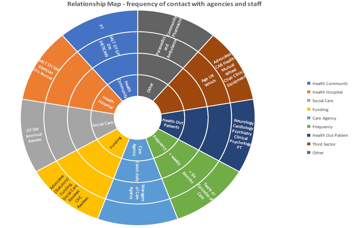
“The colour coding for each of the services was very positive and encouraging.”
“You can see at a glance who is involved.”
“Really good overview of everything.”
“You could have all the services on one side and the ones you are using at the moment on the other.”
“You can be overwhelmed by information and how complex it can be – this makes it look easier and prompts you to think of all the people that can be involved and can help.”
PPI comments
2. A spider diagram: provides a ‘helicopter view’ of service providers. The person with dementia and their family are in the centre. It is possible to click through to further information and pathways for each agency/service included in the diagram (1, 2).
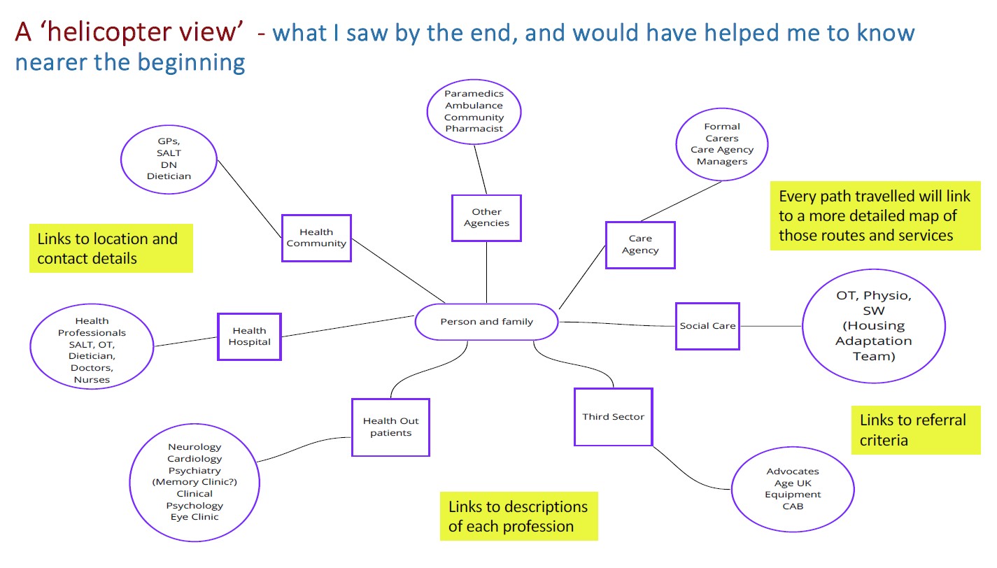
“the most helpful diagram of all of them, especially with links to click through to find further information when needed.”
“this one doesn’t work for me – confusing and unhelpful.”
“this would make a big difference to a person’s ability to care for themselves!”
PPI comments
3. An Eco Map: showing the connections needed to achieve what is important to and important for a person. The example below focuses on the longing of a person with dementia to see bluebells again (1).
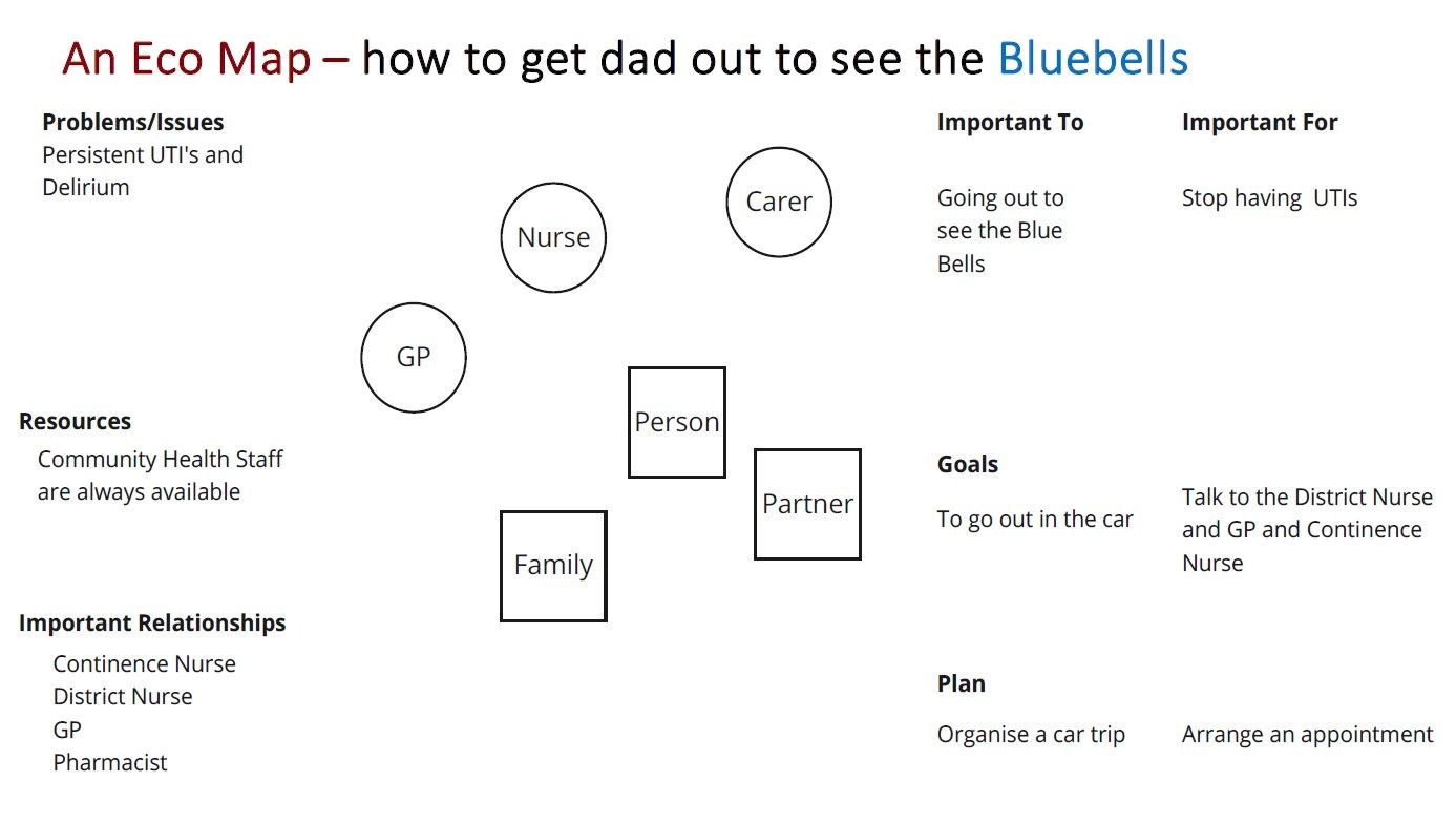
“Good for prioritising what to focus on.”
“We used this approach to challenge the professional view of what was important to our dad – it made a tremendous difference for him.”
“Combining goals, resources and planning was a bit confusing for me.”
PPI comments
4. Checklists: (1, 2): a simple list of items required, jobs to be done, important contacts and other important information. The group weren’t all sure it was a ‘visual method’ but almost everyone was creating and using them in some shape or form. There was a general agreement that with good design, colour coding etc, and the ability to print them off or keep them on a phone or tablet, their value could be greatly enhanced. PPI comments included:
“These can be fantastically useful – pin it up on the fridge, or a pin board.”
“Keep them very simple, well designed. Not overwhelming.”
“We took photographs of what was needed for my husband with dementia. These became reminders of things that could be done – or showed what to do next. These were shown on the phone, or a tablet.”
“When I heard the word checklist my heart sank. I can’t face filling in boxes and checking what needs to be done.”
“Checklists can help but the downside is the anxiety that could be generated, they could be overwhelming.”
“Timing and simplicity are crucial.”
PPI comments
Reflecting on why these visual approaches help, the PPI group felt that:
- The diagram is a portable memory
- We can share, discuss, change and correct diagrams easily
- Diagrams can reduce information load/overload
- When discussing difficult information, diagrams can help people to approach topics in a gradual way
- They can help with feeling understood and supported when you are alone at home
Feedback from Carers groups, Dementia Advisers and Reference Group members
During that summer, these initial reflections on visual methods were shared with carers groups in Oxfordshire, Dementia Advisors and Reference Group members to further explore their potential usefulness for research on developing interventions that support the navigation of services for dementia care. All thought that there were significant merits in all four approaches listed above. Their comments about the potential advantages and disadvantages often mirrored those of the PPI group.
Members of all groups said that having a Relationship Circle could make a big difference to their work. Carers particularly liked the spider diagram, with one commenting: “your idea of a road map is excellent and feasible”. A Dementia Advisor explained that she already used this approach with families to sketch out their current and potential services. Most were familiar with checklists and there were further discussions about how to enhance their value. Commenting on Eco-Maps, a Dementia Advisor said “What I liked was the steps going to the end – I wouldn’t have thought about it in that way.” Service providers were generally concerned about the feasibility of keeping details of services up-to-date.
The way forward
In June 2023, a 2 day research workshop was held by the project team in Oxfordshire with service users, service providers and researchers to identify topics for further research (1). The participants prioritised the idea of personal ‘hand held’ records (similar to the red book given to parents of newborns in the UK). These findings of the PPI group and subsequent conversations with stakeholders suggest that the use of visual approaches would be a valuable component of such records.